
I thought my digipak also felt a bit aged what with the rough edges and textures included, however I don't feel this was explored any further so was not very coherent as a theme throughout my work.

 |
I used a black and white filter on my video in order to give it a vintage feel in keeping with the old and grungy house style of my project, in my ancillary task I gave the poster a tea stained effect which is stereo-typically linked with the style of old posters.
I think I could've linked them more effectively and made it more coherent by using things such as a static tv render and a film effect.
|
The font I used was the same across all my print production with maybe one different font used as a filler for details. This was not taken forward into video because there no text.
The font I used was pretty big and often white,red or black this was because it went with the political theme of propaganda.


I tried to keep the look consistent by using the same font for all the titles and main headings, but I kept each panel unique by using seperate filler fonts for the smaller details, which I think was effective because it keeps things interesting for the consumer.
The girl in the video was moving in a lizard like way, I feel this connects to my digipak as I have a girl on my digipak cover with scales as an overlay, it was also used in my poster with scales on the boy.
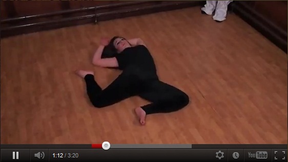

Although its not a continuously reaccuring theme and was not too obvious it was definitely part of the idea and it lead me to use a face mask peeling off someone's arm at the end of the video, this was meant to signify the shedding skin of a reptile.

In our video an overlay comes up, its a political poster and it has our actor in the centre, giving a speech.

This ties back to my digipak as it is solely based on political style posters and propaganda.
We considered scrapping this idea from the video, however we decided to keep it in as it made my print work much more coherent and consistent. I feel if we had not included it my work would have seemed out of place and random.
However we actually had much darker colors in the video than those that I used in my digipak, my digipak included lighter however more subdued de-saturated colours. This isn't consistent however to a point I feel the dark colors used in my video would have been inappropriate on my digipak considering it was supposed to be a propaganda theme.
The colors used in my ancillary task were all the same with the red and dark grey coloring.
 C 11% M 82% Y 80% K 2%
 C 64% M 57% Y 60% K 37%
 C 15% M 1% Y 97% K 0%
 C 58% M 68% Y 62% K 55%
Overall I'm not sure my music video and print production look together as a package, Lizards and propaganda did not feature too heavily in the video so I think I've let myself down in the production of the video.
One way in which I could have tied the two tasks together could have been to include the main character in the print task, this would bridge the gap between the two and pull everything together.